In just a few days—April 21, 2015—Google is poised to unveil one of the biggest changes to their search engine rankings ever.
Web marketing geeks around the world are calling it “MobileGeddon”… Companies around the world are scrambling to meet this deadline so they can avoid a harsh Google penalty that could cost them thousands or even millions of dollars in lost revenue…
But if you’re an Optimized Marketing client, it’s nothing to worry about.
What’s the big deal with MobileGeddon, what is it, and how does it affect you, your business, and your bottom line?
We’re glad you asked.
Mobile Is Growing Exponentially
If you want to know why mobile is so important—and why it’s getting more and more important by the day—just take a look at this graph from comScore:
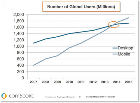
Mobile is growing exponentially
You’ve heard it before, but it bears repeating: the world is going mobile. And if your website isn’t keeping up, you’re about to fall behind.
Why does Google care so much about mobile?
Well, think about it like this. Google is currently:
- The world’s #1 largest mobile platform provider (Android)
- Owner of the world’s #1 biggest app store
- The world’s #1 biggest mobile search engine
So…yeah.
As the world goes more and more mobile, Google stands to make a lot of money.
Because of this, they want to make sure their users have the best mobile experience possible.
And that, friends, brings us to MobileGeddon.
Basically, MobileGeddon means this:
After April 21, 2015, any website that doesn’t meet Google’s new standards for mobile optimization will fall off the Google radar for mobile searches.
Your site could be the #1 mobile result on April 20…but if your site doesn’t meet Google’s standards for mobile friendliness, then on 4/21 your site won’t even be on the first page.
So what does “mobile-optimized” mean?
Web marketing geeks (like our entire team here at Optimized Marketing) throw around the phrase “mobile optimized” a lot.
“Mobile optimized” means a lot of things. For example, a mobile-optimized size is one that:
- Loads quickly on a phone
- Is resized to fit the small screen of a phone
- Has bigger text, bigger buttons, and smaller pictures
- Has links that are spaced far enough apart that you don’t accidentally tap the wrong link
- Avoids using software that’s uncommon on phones, like Flash
- Is designed so that you never have to scroll horizontally, only vertically
Basically, a “mobile optimized” site just means that a website is designed to give users a good experience when they’re on their phones.
How can you tell if your site is mobile-optimized?
Fortunately, Google provides a tool that can tell you automatically if your site meets their strict standards.
We encourage you to navigate here and enter your own URL to see if your site is about to rise in the search engine rankings…or if it’s poised to plummet.
Hopefully, you get a screen that looks like this:
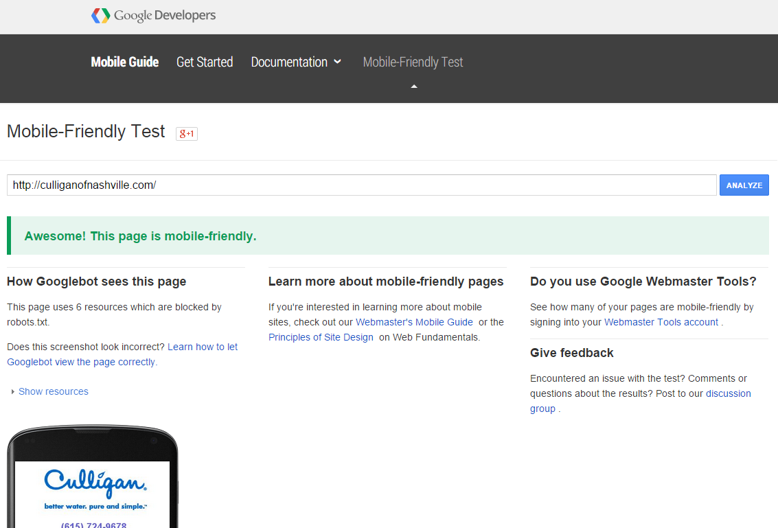
(Culligan of Nashville is an Optimized Marketing client.)
If your site fails the test, on the other hand, you’ll see something like this:

Uh-oh.
One Mobile Page Isn’t Enough
Keep in mind that the new algorithm will assess each page individually.
This means that if you have only one mobile-optimized page, like a mobile homepage, Google will show only that one page in their search engine results.
(It won’t show any of the other, non-mobile-optimized pages.)
If your entire site is mobile-friendly, on the other hand, then Google can potentially show multiple pages in their search results.
For example of why this could make you (or cost you) a fortune in revenue, take a look at this picture:
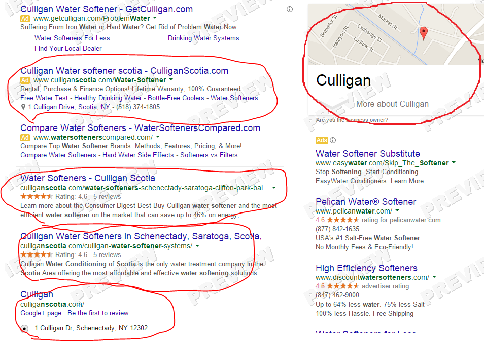
Google results for “Scotia water softener” (for users in the Scotia area)
In this picture you can see that our client, Cullgan Scotia, appears 5 times for the lucrative search query “Scotia water softener”:
- Adwords ad
- “Water Softeners” page
- “Water Softener Systems” page
- Homepage
- Google Maps location
In this picture there are 10 links you can click on, including the map. And Culligan Scotia takes up half of this valuable real estate on the page.
Scotia is dominating their local market.
But if all you have is a single mobile page, then this kind of search-engine domination will be impossible after 4/21.
What’s our solution here at Optimized Marketing?
At this moment, on April 10, all of our Culligan sites already have fully a compliant mobile-friendly homepage—which means that all of our clients’ sites will should be receiving a boost to their mobile rankings on 4/21.
But as always, we aren’t stopping there.
We’re very close to deploying a mobile solution that will allow all of our clients’ sites to have a mobile version of their entire site—which means Google will send organic traffic not just to the homepage, but also to the water softeners page, the reverse osmosis page, etc.
(This means more free organic traffic for you.)
And, to top it off, we’re giving our optimizers the ability to create mobile-only pages. What that means is that Amanda, Mark, and Neil will be able to create landing pages specifically designed for mobile users.
(This means that more of those mobile visitors will turn into new customers.)
What should you do if you aren’t an OM client?
If you aren’t currently an Optimized Marketing client, we urge you to test your website’s mobile friendliness using Google’s free tool.
Then, one of two things will happen:
1) If your site is mobile-friendly, then you can breathe a sigh of relief…but don’t get too relaxed. Yes, your site is mobile-friendly—but you may be one of the many sites out there that have only a single mobile-optimized homepage. Ask your web marketing provider more about your mobile solution, and insist on having at least one mobile-optimized page for every service you provide: water softeners, reverse osmosis, bottled water delivery, C&I…the works. And while you’re at it, ask what they’re doing to optimize your Google places and G+ pages. Those are becoming more important in your search rankings, too.
2) If your site isn’t mobile-friendly, then you could be in trouble. Ask your web marketing provider what they plan to do about the algorithm change (they are aware of the algorithm change, aren’t they?). Insist that your site be optimized before the deadline on 4/21. Make sure they follow through on it. Then, re-read the paragraph above this one.
If one thing is constant…
If there’s one thing that’s a constant in digital marketing, it’s change. Google is constantly tweaking their search engine algorithm, and before long, they’ll release another big update.
The real question you should be asking is not: “Are we prepared for MobileGeddon?”
The real question you should be asking is: “Do we have a web marketing company that is on top of all these changes? A company that takes advantage of new tools & technologies and strives always to be at the forefront of their industry?”
If your answer to that important question isn’t a resounding YES, then you’re being short-changed, and we urge you to reach out to us at Optimized Marketing.
-Neil Flinchbaugh
Internet Marketing Scientist at Optimized Marketing